Jetpack Compose: What’s a Scaffold?
A Hands-On Tutorial #
Jetpack Compose Scaffold is a pre-designed layout component in the Jetpack Compose UI toolkit. It provides a basic structure for creating a screen in an Android app. Developers should use Jetpack Compose Scaffold because it simplifies the process of creating a consistent, Material Design-compliant interface for their app, freeing them up to focus on building out its unique functionality.
This tutorial will walk you through the basic usage of a Scaffold and all its components, such as:
- Top Bar
- Bottom Bar
- Content
- Floating Action Button
- Snackbar
- Drawer
Additionally, the tutorial will walk-through the steps that are necessary to dynamically show and hide the top- and bottom bar and the floating action button. When hiding the top- and bottom bar, an animation will be used to provide a soft transition.
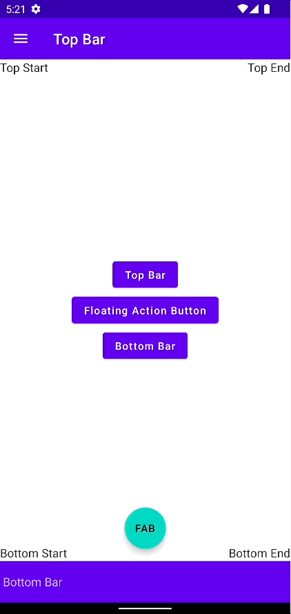
Below is an overview of a Scaffold with all its elements being visible.

Scaffold #
Let us dive right in and have a look on how to declare a Scaffold.
Scaffold(
	scaffoldState = scaffoldState,
	content = { padding->
		Content(
	    padding,
      topBarState,
      bottomBarState,
      fabState
    )
	},
  topBar = { TopBar(scaffoldState, topBarState) },
  bottomBar = { BottomBar(bottomBarState) },
  floatingActionButtonPosition = FabPosition.Center,
  floatingActionButton = {
		if (fabState.value) {
			FloatingActionButton(scaffoldState)
    }
	},
  drawerContent = { DrawerContent() },
)
Nothing new under the sun, just the “framework” so to day that holds the different pieces together.
What needs some explanation are the different states we need:
val scaffoldState = rememberScaffoldState()

val topBarState = remember { mutableStateOf(true) }
val bottomBarState = remember { mutableStateOf(true) }
val fabState = remember { mutableStateOf(true) }
The most important is scaffoldState. The rememberScaffoldState() -function in Jetpack Compose is used to save and restore the state of a Scaffold component between different screens in an app. This helps maintain the state of the Scaffold, such as the open/closed state of the Drawer, when navigating between screens.
The other states are being used to indicate whether they are visible or not.
Top- and Bottom Bar #
The Top and Bottom Bars provide spaces at the top and the bottom of the screen for app-related actions and navigation. They typically contain elements such as the app title (top only), navigation icons, and action buttons. It’s a good way to provide quick access to important actions within the app, making it easier for users to navigate and interact with the app. Additionally, they provide visual structure and consistency to the app’s interface, which can improve the overall user experience.
@Composable
fun TopBar(scaffoldState: ScaffoldState, state: MutableState<Boolean>) {
	val coroutineScope = rememberCoroutineScope()
  AnimatedVisibility(
		visible = state.value,
    enter = slideInVertically(initialOffsetY = { -it }),
    exit = slideOutVertically(targetOffsetY = { -it }),
    content = {
			TopAppBar(
				title = { Text("Top Bar") },
				navigationIcon = {
					IconButton(
						onClick = {
							coroutineScope.launch {
								scaffoldState.drawerState.open()
							}
		        }
					) {
							Icon(
								Icons.Filled.Menu,
								contentDescription = "Localized description"
							)
					}
				}
			)
		}
	)
}
@Composable
fun BottomBar(state: MutableState<Boolean>) {
	AnimatedVisibility(
		visible = state.value,
	  enter = slideInVertically(initialOffsetY = { it }),
    exit = slideOutVertically(targetOffsetY = { it }),
    content = {
			BottomAppBar{Text("Bottom Bar")}
    }
	)
}
Floating Action Button #
The Floating Action Button (FAB) is a circular material design button that is used for a promoted action in the interface. It’s usually displayed in the bottom-right corner of the screen, floating above the interface. The Floating Action Button is designed to be used for a single, important action that users can perform on the screen, such as creating a new item, saving an item, or sharing content. The Floating Action Button’s visually prominent position and distinctive shape make it a recognizable and easily accessible way for users to perform important actions in the app.
@Composable
fun FloatingActionButton(scaffoldState: ScaffoldState) {
	val coroutineScope = rememberCoroutineScope()
  androidx.compose.material.FloatingActionButton(
		onClick = {
			coroutineScope.launch {
				scaffoldState.snackbarHostState.showSnackbar("FAB Action Button Clicked")
			}
		}
	) {
			Text("FAB")
	}
}
Snackbar #
The Snackbar is a lightweight, transient message UI element in Material Design. It provides brief feedback about an operation in the form of a message that appears at the bottom of the screen, similar to a toast. Snackbars are used to display brief, non-interruptive messages to users that inform them of the result of an operation, or to suggest a quick action that can be performed. They typically appear for a short period of time, and then automatically disappear. Snackbars are designed to be used for lightweight and non-intrusive messaging, and are an effective way to provide feedback to users without interrupting their current flow or context. In Jetpack Compose, the Snackbar component can be used to easily create and display snackbars in your app.
There is no code that I could show you for the snackbar. Everything is being taken care of by Jetpack Compose.
Drawer #
The Drawer is a UI component in Material Design that provides a sliding panel for navigation and access to app content. It’s usually displayed to the left of the screen, and can be opened by swiping from the left edge of the screen or by tapping an icon in the App Bar. The Drawer can contain a navigation menu, links to other sections of the app, and other elements. When the Drawer is closed, it’s out of view, and only a portion of it is visible as a navigation indicator in the App Bar. The Drawer is an effective way to provide access to a large number of navigation options and app content without cluttering the main screen.
@Composable
fun DrawerContent() {
	Column(
		modifier = Modifier.fillMaxSize(),
    verticalArrangement = Arrangement.Center,
    horizontalAlignment = Alignment.CenterHorizontally
  ) {
		Text("Drawer Content")
	}
}
Dynamically Showing and Hiding Components. #
Whereas the drawer and the snackbar are handled by the Scaffold itself, a requirement that I had was to dynamically show and hide the top- and bottom bar and also the floating action button.
In order not to show the Floating Action Button, it will just be set to Unit if it shall not be shown.
floatingActionButton ={
	if (fabState.value) {
		FloatingActionButton(scaffoldState)
  }
},
The bars will have an animated transition with the AnimatedVisibility-composable. It is a component that provides a way to animate the visibility of other components. When the visibility of a component changes, AnimatedVisibility animates the change, smoothly transitioning the component from visible to invisible or vice versa. This can provide a better user experience, making the change in visibility feel more natural and intuitive without the developer having to write any complex animation code.
AnimatedVisibility(
	visible = state.value,
  enter = slideInVertically(initialOffsetY = { -it }),
  exit = slideOutVertically(targetOffsetY = { -it }),
  content = {
		TopAppBar(...) {...}
	}
)
This concludes this tutorial on Jetpack Compose Scaffold. I hope you found it useful. Feel free to leave any comments.
The full Android Studio project can be found in my Github-repository of Android and iOS code examples.
Thank you for reading!
- If you enjoyed this, please follow me on Medium
- Buy me a coffee or send me a tip
- Support me and other Medium writers by signing up here
https://twissmueller.medium.com/membership