Kotlin Multiplatform: Tab Navigation
One of my favorite methods for navigating different views in a mobile app is tab-navigation. I prefer it over other navigation methods mainly because I can use it with my thumb using one hand only.
Therefore, incorporating tab-navigation has become a standard practice in my mobile app development. Fortunately, there’s a library for Kotlin Multiplatform Mobile that allows us to write navigation code once for multiple platforms.
This post outlines all the necessary steps to add three example tabs to an application. As with my previous post on Kotlin Multiplatform, I typically use this pattern in a new application by copying and pasting the relevant code-snippets.
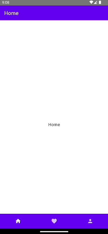
Below is a depiction of the sample app’s layout. At the top, there’s a title bar. The main content is in the center, and the navigation bar is at the bottom.
We’ll start by adding the dependencies in gradle/libs.versions.toml:
[versions]
...
voyager = "1.0.0"

[libraries]
...
voyager-tab-navigator = { module = "cafe.adriel.voyager:voyager-tab-navigator", version.ref = "voyager" }
voyager-transitions = { module = "cafe.adriel.voyager:voyager-transitions", version.ref = "voyager" }
Next, we’ll incorporate the dependencies into our source-set, which can be found in composeApp/build.gradle.kts.
kotlin {
  ...
  sourceSets {
		...
		commonMain.dependencies {
			...
			implementation(libs.voyager.tab.navigator)
			implementation(libs.voyager.transitions)
		}
  }
}
Now, synchronize your IDE so the changes can take effect.
We now need to add some wrapper code for our navigation items. This code should be added to the file composeApp/src/commonMain/kotlin/TabNavigationItem.kt.
import androidx.compose.foundation.layout.RowScope
import androidx.compose.material.BottomNavigationItem
import androidx.compose.material.Icon
import androidx.compose.runtime.Composable
import cafe.adriel.voyager.navigator.tab.LocalTabNavigator
import cafe.adriel.voyager.navigator.tab.Tab

@Composable
fun RowScope.TabNavigationItem(tab: Tab) {
    val tabNavigator = LocalTabNavigator.current

    BottomNavigationItem(
        selected = tabNavigator.current.key == tab.key,
        onClick = { tabNavigator.current = tab },
        icon = { Icon(painter = tab.options.icon!!, contentDescription = tab.options.title) }
    )
}
Let’s create three tabs in our sample application: “Home”, “Favourites”, and “Profile”.
The file for “Home” is located in composeApp/src/commonMain/kotlin/HomeTab.kt.
import androidx.compose.material.Text
import androidx.compose.material.icons.Icons
import androidx.compose.material.icons.filled.Home
import androidx.compose.runtime.Composable
import androidx.compose.runtime.remember
import androidx.compose.ui.graphics.vector.rememberVectorPainter
import cafe.adriel.voyager.navigator.tab.Tab
import cafe.adriel.voyager.navigator.tab.TabOptions

object HomeTab : Tab {

	override val options: TabOptions
		@Composable
		get() {
			val icon = rememberVectorPainter(Icons.Default.Home)

			return remember {
				TabOptions(
					index = 0u,
					title = "Home",
					icon = icon
				)
			}
		}

		@Composable
		override fun Content() {
			Text("Home")
	}
}
Next, add the “Favorites”-tab in composeApp/src/commonMain/kotlin/FavoritesTab.kt.
import androidx.compose.material.Text
import androidx.compose.material.icons.Icons
import androidx.compose.material.icons.filled.Favorite
import androidx.compose.runtime.Composable
import androidx.compose.runtime.remember
import androidx.compose.ui.graphics.vector.rememberVectorPainter
import cafe.adriel.voyager.navigator.tab.Tab
import cafe.adriel.voyager.navigator.tab.TabOptions

object FavoritesTab : Tab {

	override val options: TabOptions
		@Composable
		get() {
			val icon = rememberVectorPainter(Icons.Default.Favorite)

			return remember {
				TabOptions(
					index = 1u,
					title = "Favorites",
					icon = icon
				)
			}
		}

		@Composable
		override fun Content() {
			Text("Favorites")
		}
}
Finally, you’ll find the “Profile” tab in composeApp/src/commonMain/kotlin/ProfileTab.kt.
import androidx.compose.material.Text
import androidx.compose.material.icons.Icons
import androidx.compose.material.icons.filled.Person
import androidx.compose.runtime.Composable
import androidx.compose.runtime.remember
import androidx.compose.ui.graphics.vector.rememberVectorPainter
import cafe.adriel.voyager.navigator.tab.Tab
import cafe.adriel.voyager.navigator.tab.TabOptions

object ProfileTab : Tab {

	override val options: TabOptions
		@Composable
		get() {
			val icon = rememberVectorPainter(Icons.Default.Person)

			return remember {
				TabOptions(
					index = 2u,
					title = "Profile",
					icon = icon
				)
			}
		}

		@Composable
		override fun Content() {
			Text("Profile")
		}
}
We put everything together in the file composeApp/src/commonMain/kotlin/App.kt, where we also create a Scaffold.
If you want to learn more about what a Scaffold is, please click on the link below.
https://itnext.io/jetpack-compose-whats-a-scaffold-35698b3a33b0
import androidx.compose.animation.AnimatedVisibility
import androidx.compose.foundation.Image
import androidx.compose.foundation.layout.Column
import androidx.compose.foundation.layout.RowScope
import androidx.compose.foundation.layout.fillMaxWidth
import androidx.compose.material.BottomNavigation
import androidx.compose.material.Button
import androidx.compose.material.MaterialTheme
import androidx.compose.material.Scaffold
import androidx.compose.material.Text
import androidx.compose.material.TopAppBar
import androidx.compose.runtime.Composable
import androidx.compose.runtime.getValue
import androidx.compose.runtime.mutableStateOf
import androidx.compose.runtime.remember
import androidx.compose.runtime.setValue
import androidx.compose.ui.Alignment
import androidx.compose.ui.Modifier
import cafe.adriel.voyager.navigator.tab.CurrentTab
import cafe.adriel.voyager.navigator.tab.TabDisposable
import org.jetbrains.compose.resources.ExperimentalResourceApi
import org.jetbrains.compose.resources.painterResource
import cafe.adriel.voyager.navigator.tab.TabNavigator

@OptIn(ExperimentalResourceApi::class)
@Composable
fun App() {
	MaterialTheme {
		TabNavigator(
			HomeTab,
			tabDisposable = {
				TabDisposable(
					navigator = it,
					tabs = listOf(HomeTab, FavoritesTab, ProfileTab)
				)
			}
		) { tabNavigator ->
				Scaffold(
					topBar = {
						TopAppBar(
							title = { Text(text = tabNavigator.current.options.title) }
						)
				},
				content = {
					CurrentTab()
				},
				bottomBar = {
					BottomNavigation {
						TabNavigationItem(HomeTab)
						TabNavigationItem(FavoritesTab)
						TabNavigationItem(ProfileTab)
					}
				}
			)
		}
	}
}
That’s it! We’ve successfully applied tab-navigation to our sample application.
I hope you enjoyed this article and found it useful.
If you have any further questions, need specific code examples, or require additional assistance, please don’t hesitate to leave a comment or send me a message.